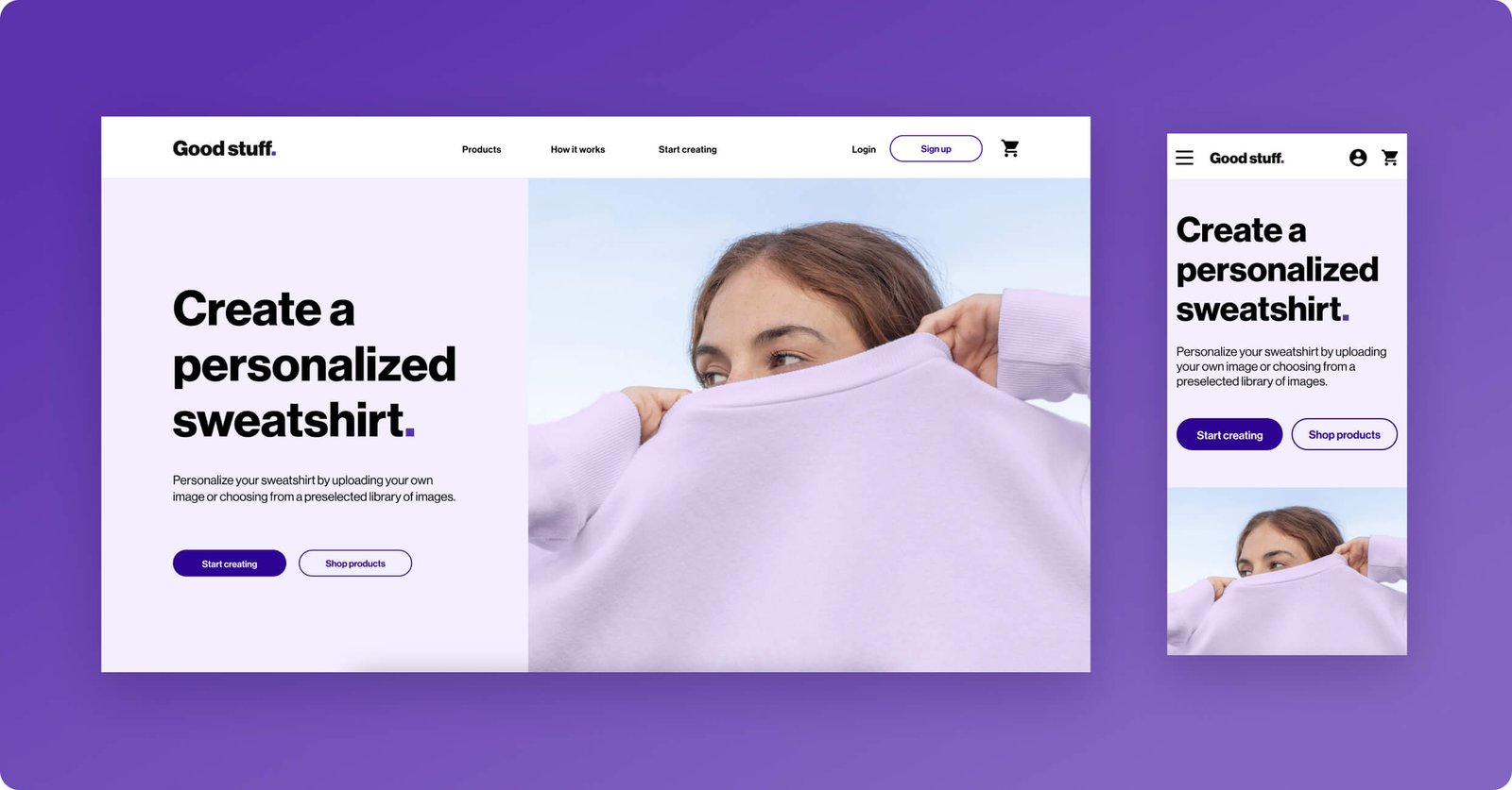
Good stuff is a responsive website that allows online shoppers to select and customize sweatshirts. I wanted to find out if the main user experience, choosing and designing sweatshirts, was easy for users to complete. I also wanted to understand the challenges users face during the shopping, customizing, and ordering process.
Role
Lead UX visual designer
Responsibilities
User research & testing, responsive design, visual design, prototyping for desktop & mobile
Tools
Adobe XD, Stark, Google Suite
The problem
How to design a website that allows online shoppers to seamlessly customize and order the sweatshirt they want on any device.
The project goal
Create a responsive website that allows users to easily choose and custom design sweatshirts.
The design-thinking process
Empathize
Who is the primary user & what are their goals?
To start off, I conducted 1:1 interviews aiming to understand the users and their behavior and attitudes towards personalizing and ordering apparel online. After interviewing six participants, it became evident that the primary user fell within the same category:
young adults who need a simple and intuitive way to custom design and order sweatshirts.
User research - Pain points
Overwhelming user interface
Substandard product quality
Limited customization
Non-responsive design
High pricing
User persona & journey map
User persona 1
User persona 2
Define
With the personas in mind, the problem statement was created:
Eddie is a lead guitarist who needs to easily personalize and order multiple hoodies online because they want their rock band members to match on tour.
Ideate
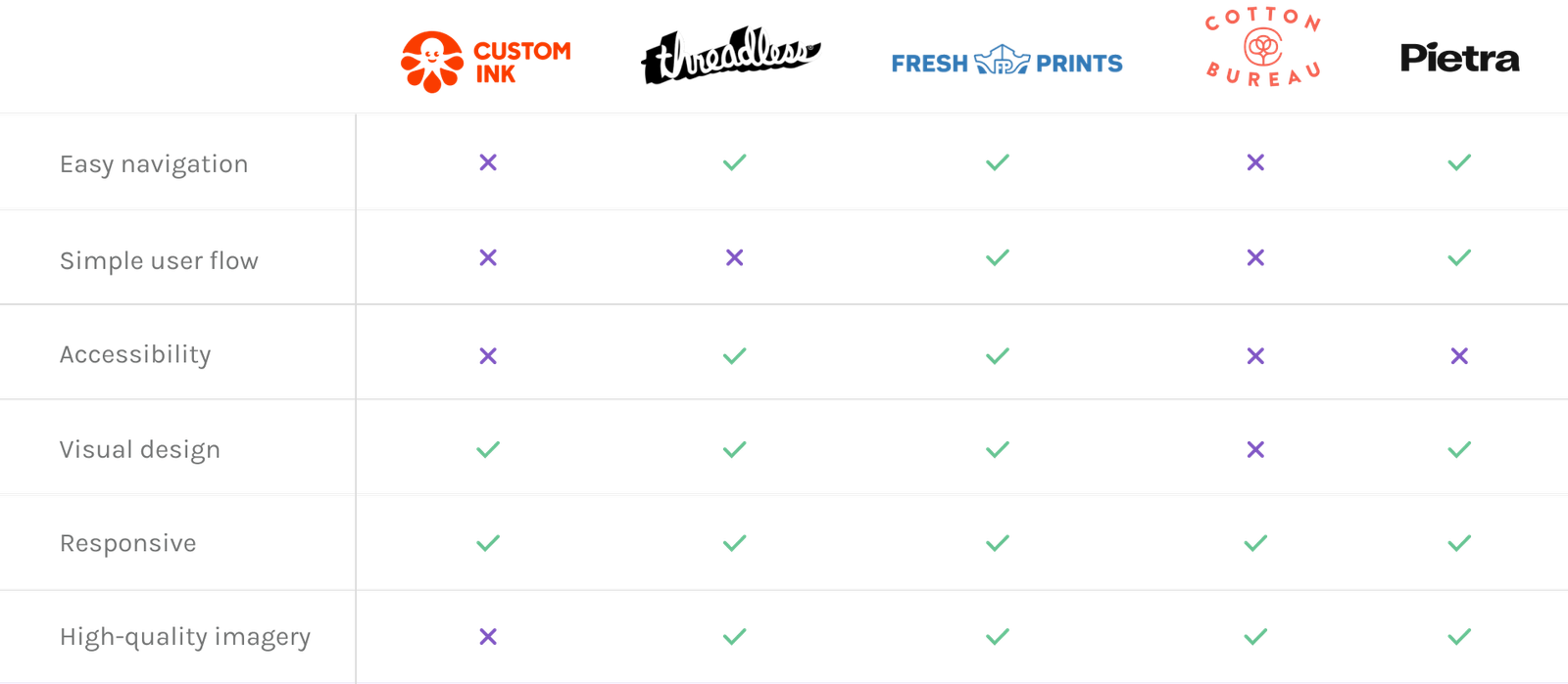
Competitive analysis
To further my user research, I had to see what other custom apparel companies were doing and what user goals they were and weren’t reaching. By researching several competitors, such as Custom Ink, Threadless, Fresh Prints, Cotton Bureau, and Pietra, I revealed several insights.
“How Might We”
Information architecture - Sitemap
Based on all findings and research up until now, I created a sitemap, or clear, organized flow that takes the users from one task to the next. Organizing your site using a clear structure allows all site visitors, including those using assistive technologies, to navigate your site more efficiently.
Prototype
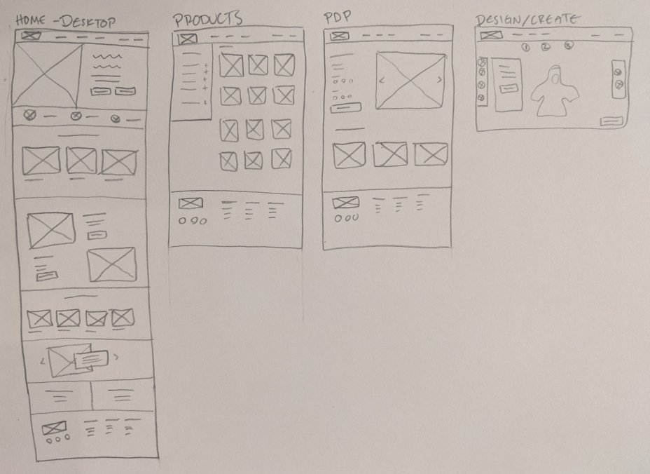
Paper wireframes
In order to quickly create the basic structure of the website and depict the overall functionality, I sketched paper wireframes for desktop, mobile and tablet resolutions.
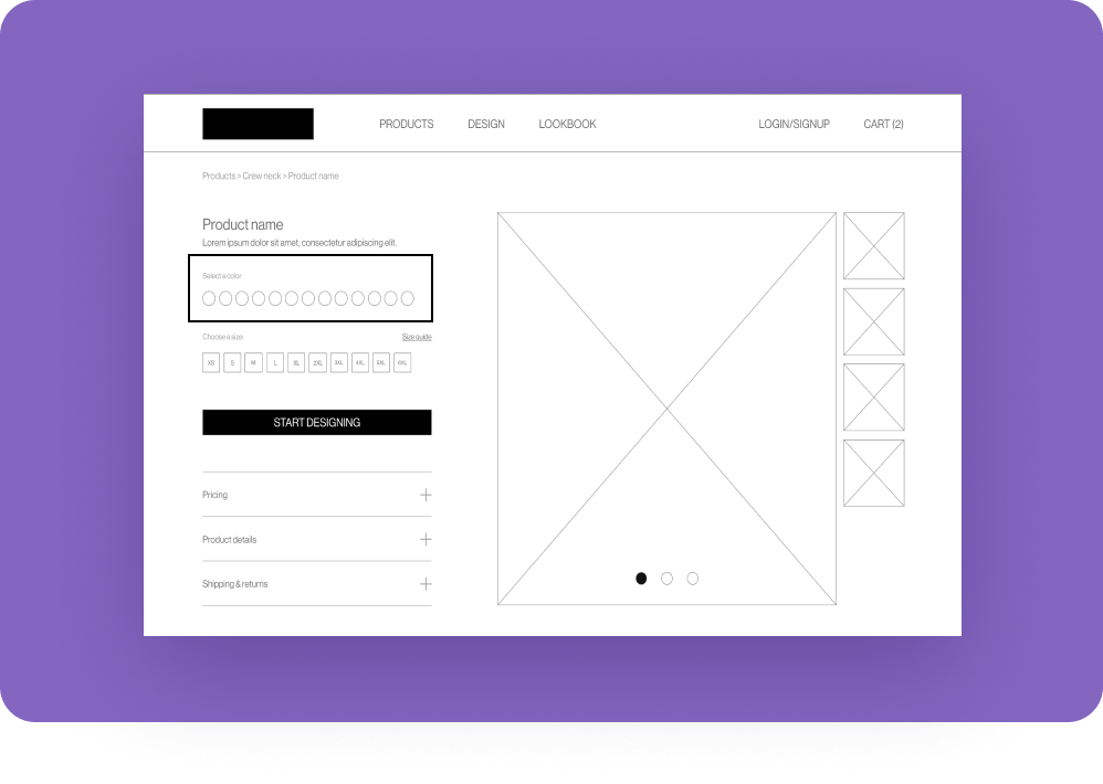
Low fidelity prototype
From the paper wireframes, I created digital wireframes. From here I created a low fidelity prototype that provides a basic idea of what the primary user flow would look like and how it would function. The goal of this lo-fi prototype was to make designs testable through a usability study, so I’d be able to collect and analyze feedback early on.
I conducted two rounds of usability studies. For the first usability study, I tested the low fidelity prototype on five participants. The findings from this first study helped guide the designs from simple wireframes to more detailed mockups.
Usability study 01 findings
Insight One
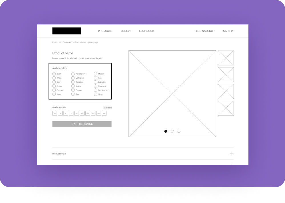
Based on the theme that: for most users, it’s not immediately clear which color they are selecting while filtering, an insight is:
Add text labels to color selections.
Insight Two
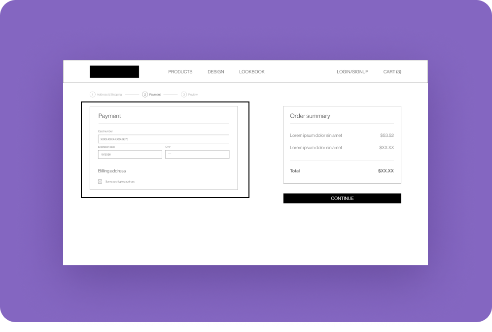
Based on the theme that: users want more options to pay since they don’t trust paying online with a credit card, an insight is:
Add more payment options on the payment screen at checkout.
Insight Three
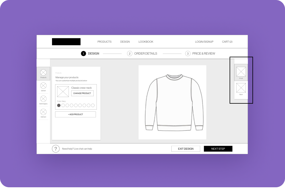
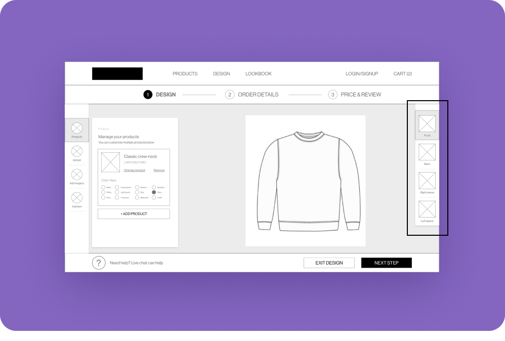
Based on the theme that: most users would like more customization of their design placement, an insight is:
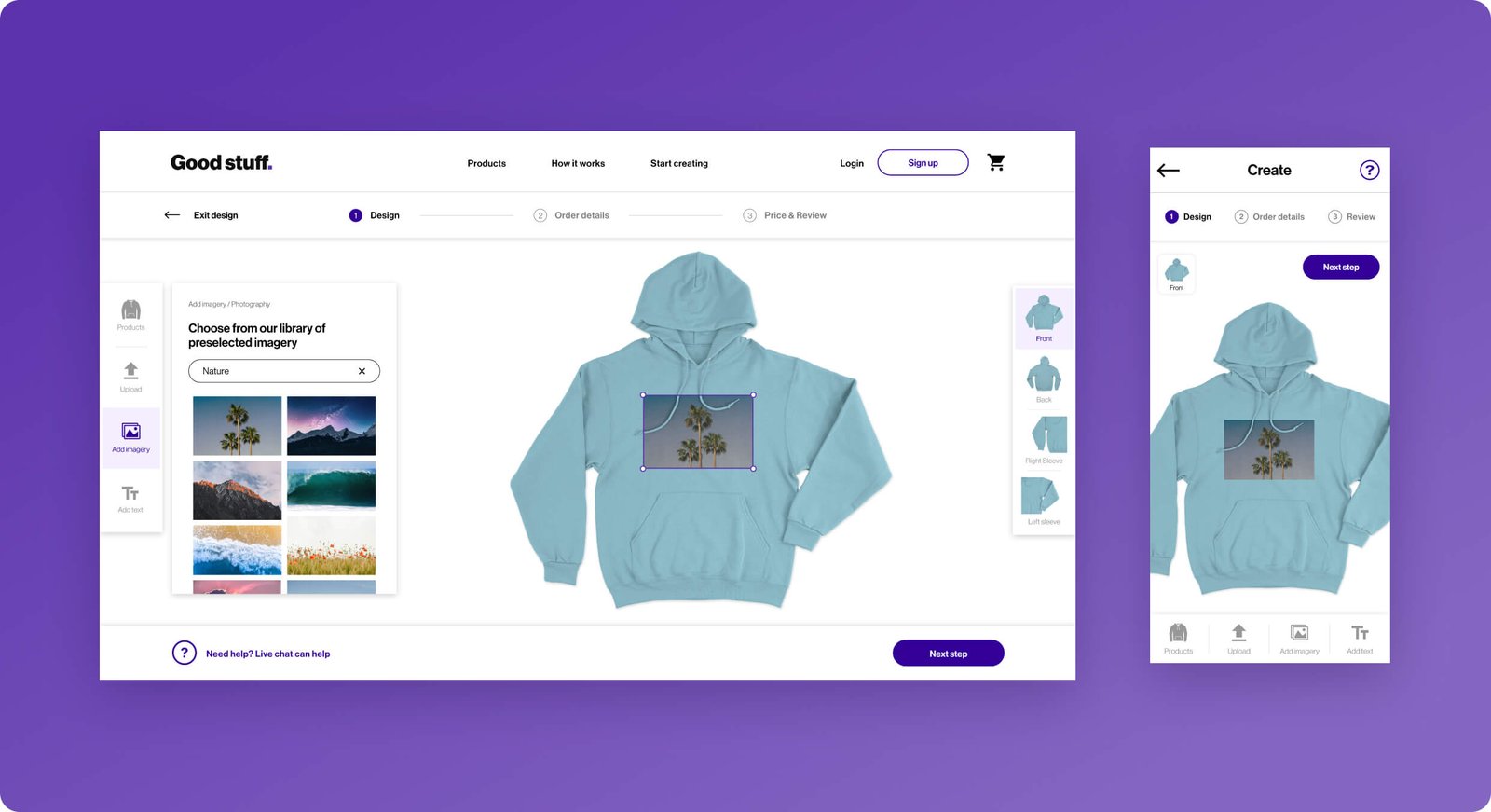
Display more areas on the sweatshirt, like sleeves, where designs can be added.
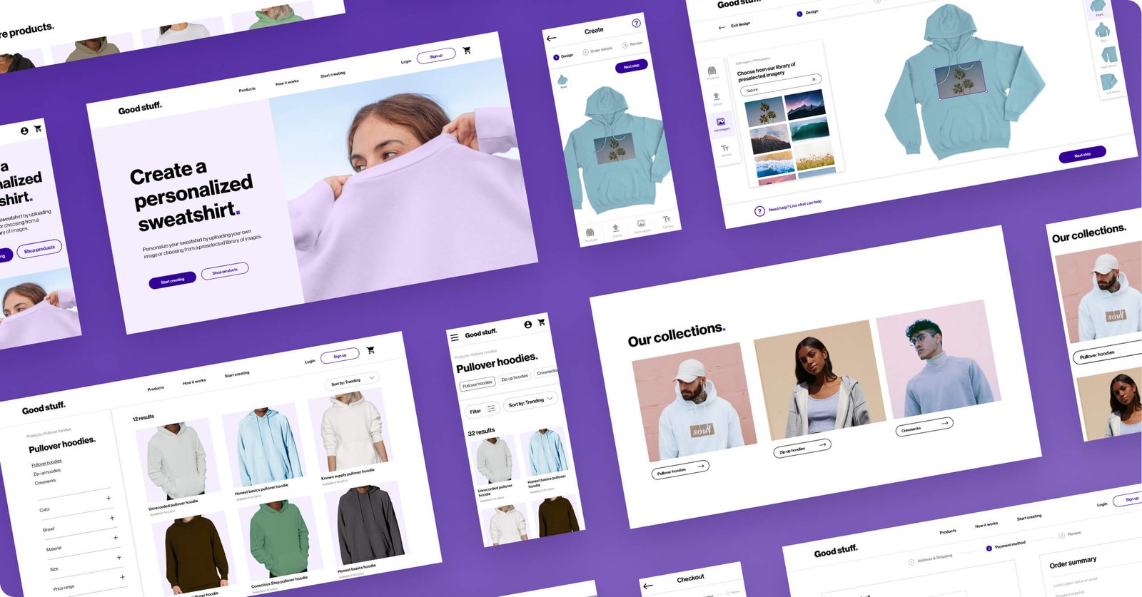
High fidelity prototype
After conducting the initial round of usability tests, I converted the low fidelity prototype into high fidelity mockups and prototypes for mobile and desktop.
Using the plugin Stark, I made sure that all text, buttons, icons, etc. comply with WCAG color contrast standards. By ensuring that these components have enough color contrast, I made sure that those who are visually impaired or colorblind still have a successful user experience.
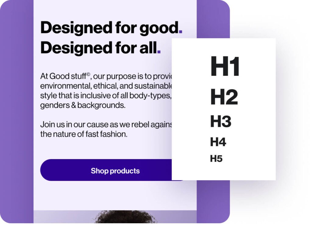
Hierarchical headings
Headings can help all users navigate a webpage, and can specifically help those using a screen reader navigate more easily through the menu options.
Headings are an effective way to scale the size of the text based on its importance on the page. Having specific heading tags allows screen readers to understand the hierarchy of the page. Different-sized headings can be annotated with H1, H2, H3, and so on to further indicate the hierarchy.
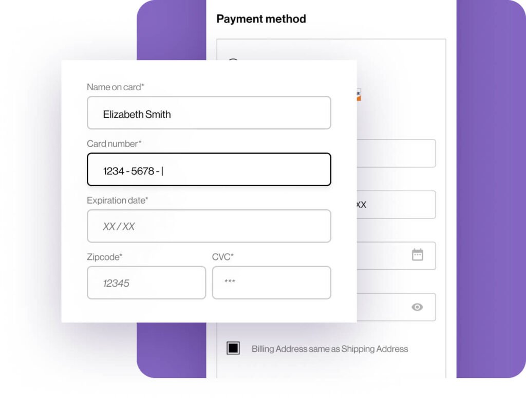
Forms & labels
I gave every form field a visible label that doesn’t disappear. Labels add descriptive language to interactive UI elements on the webpage and help indicate the purpose of the elements. When labels disappear it can confuse users and creates a bad user experience, so I made sure the labels are visible at all times.
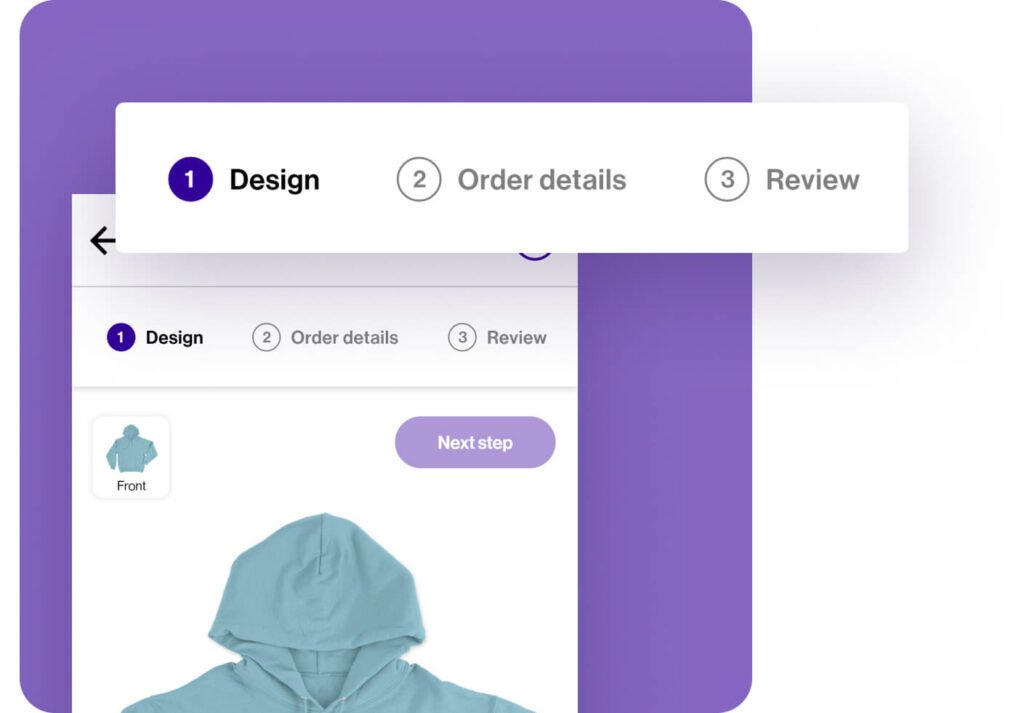
Linear focus order
I incorporated numbers and annotations to indicate the transversal order, also known as linear focus order, in which users would navigate through the site. This also sets the order in which a user would tab through items on the website if they use a keyboard instead of a touchscreen or mouse.
Takeaways
Working on the website for Good stuff was enjoyable and satisfying. I have worked across many responsive websites throughout my design career, so applying the entire design process and creating a product that focuses on user needs and accessibility was extra rewarding.
For next steps, I plan on continuing the design, test and iteration process. I would like to conduct further testing to determine if there are more user needs or pain points that need to be addressed.