UX / UI case study

Bundle&Bloom

Bundle&Bloom is an app that allows users preview and quickly order flower bouquets for their loved ones. I sought to understand and solve user needs and frustrations as they relate to ordering bouquets through an app.

Bumble and Bloom is a flower bouquet ordering app that allows users to easily choose and order flower bouquets

Role

Lead UX visual designer

Responsibilities

User research, user testing,
visual design, prototyping

Duration

March 2022-June 2022

Tools

Figma, Miro, Zoom, Google Suite

The problem

How to design an app that targets busy adults who don’t have much time to dedicate to choosing and buying flower bouquets for their loved ones.

The project goal

An app that allows users to easily and quickly select and order beautiful, trendy bouquets for any occasion.

User research

Who is the primary user & what are their goals?

To start off, I conducted 1:1 interviews aiming to understand the users and their behavior and attitudes toward ordering bouquets through an app. After interviewing five participants, it became evident that the primary user fell within the same category:
busy, working adults who need a quick and simple way to choose and order flower bouquets for both delivery and pickup.

bouquet-app-user-research-users

User research - Pain points

Alarm-icon

Time

Busy, working adults are often too busy to visit a florist to see different types of flowers, so they need an app that saves time and is intuitive to use.

Cart-shop

Filter feature

Most users get overwhelmed by too many bouquet options, so they would like the option to narrow down their search while shopping.

Calendar-icon

Convenience

Most users would like to efficiently plan their orders within their schedule, so they need the ability to schedule orders ahead of time.

User persona & journey map


With the persona and user journey map in mind, the problem statement was created:

Gerard is a busy professor who needs to quickly select and order a bouquet for his wife because he is pressed for time on his way home from work.

Competitive analysis

To further my user research, I had to see what other bouquet ordering companies were doing and what user goals they were and weren’t reaching. By researching several competitors, such as 1-800-flowers.com, Flowers of Fort Lauderdale, The Bouqs, and Blooms by the Box, I revealed several insights.

As depicted in the table, I found that not all of the competitors had the following:

– Easy navigation – Not all are easy to navigate and confuse the user.

– User flow – Some of the websites are overwhelming in places, and are difficult to scan quickly.

– Accessibility – Not all met the WCAG requirement for text color contrast.

– Visual design – Some competitors have inconsistent brand identities across the sites.

– Filter feature – Not all offer filter features allowing users to narrow their search.

Design

Paper wireframes

Before I moved onto high fidelity mockups and prototypes, I created paper wireframes of the primary user flow which established the basic structure of the app pages and highlighted the intended function of each element.

Low fidelity prototype - Version One

From the paper wireframes, I created digital wireframes. From here I created a low fidelity prototype that provides a basic idea of what the primary user flow would look like and how it would function. The goal of this lo-fi prototype was to make designs testable through a usability study, so I’d be able to collect and analyze feedback early on.
bouquet-app-lo-fi-prototype1-preview_2x
Test

Usability studies

I conducted two round of usability studies. For the first usability study, I tested the low fidelity prototype on five participants. The findings from this first study helped guide the designs from simple wireframes to more detailed mockups.

Usability study 01 findings

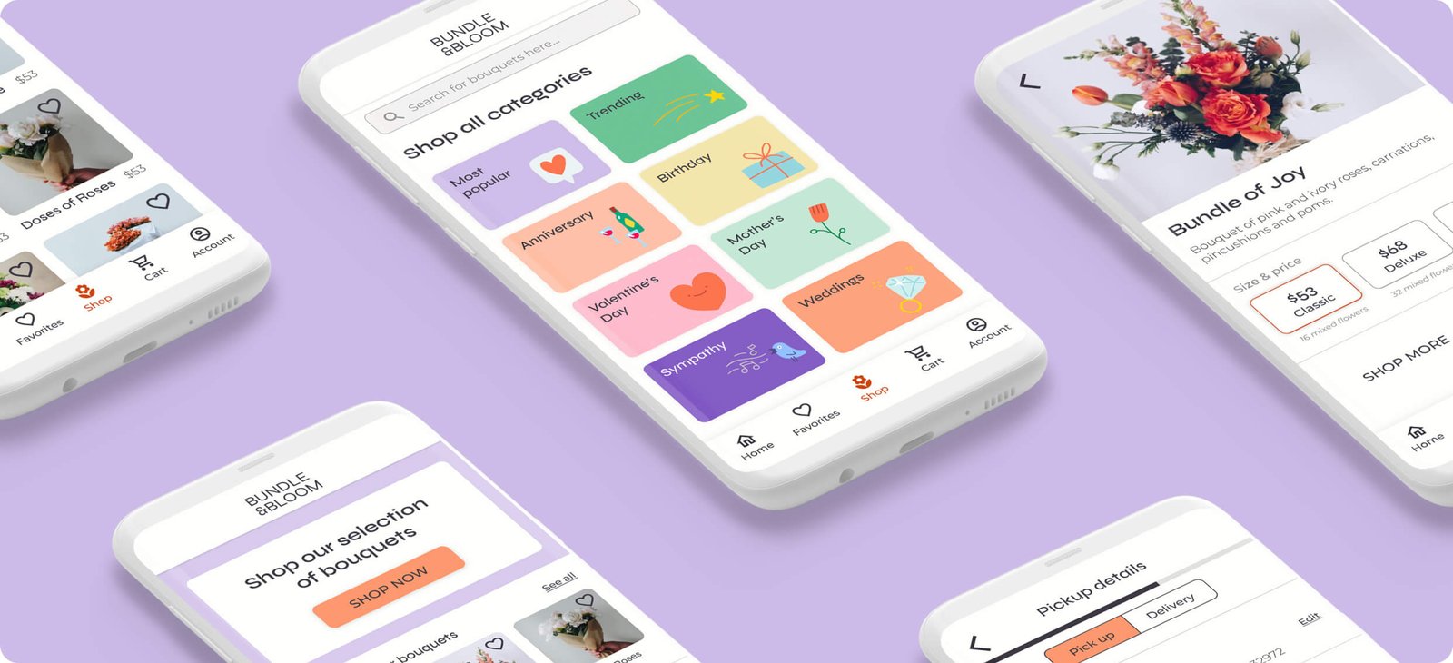
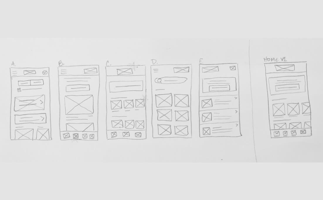
Based on the theme that: categories are useful for a majority of users, an insight is:

users need the option to be able to shop by categories.

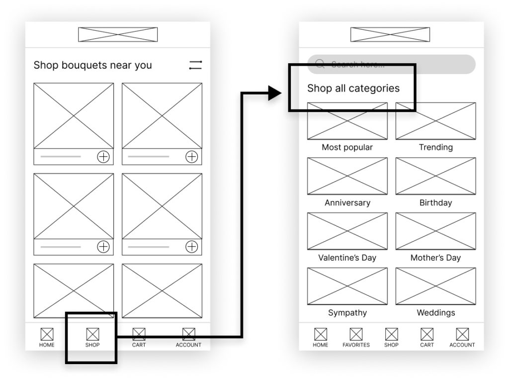
Based on the theme that: for most users, it’s not immediately clear how to filter bouquet selections, an insight is: users need better cues for what steps are required to filter their search.

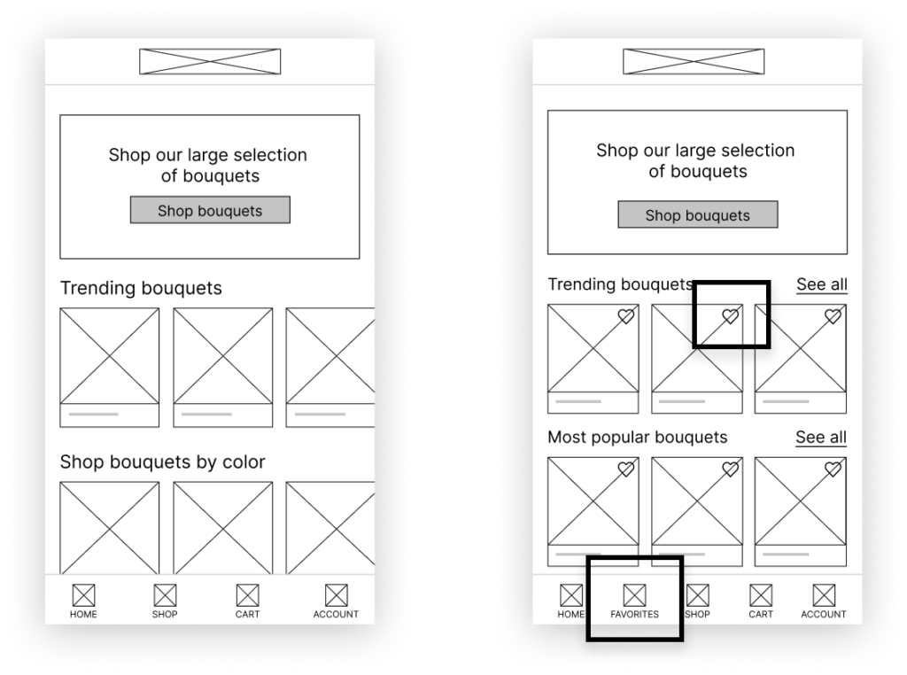
Based on the theme that: most users wanted to have a favorites feature, an insight is:
users need the option to like and save their favorite bouquets.


Based on these insights, I created high fidelity mockups and another prototype. I ran a second usability study, testing five more participants.

Usability study 02 findings

Insight One

Users needed a seamless way to choose
the date/time for pickup or delivery

Insight Two

Users wanted more payment
options on the payment screen

Taking accessibility into consideration

Hands Balance

Color contrast

Implemented color contrast ratios that comply with the WCAG standards, in order to create a perceivable experience for those who are visually impaired.

Hands Phone

Simple UI

Applied a simple, scannable interface so users don’t get overwhelmed or confused as they navigate through the app.

Hands Picture

Imagery

Used detailed visuals of each bouquet to help users understand what they’re buying and used icons across app in order to make navigation more intuitive for the user.

High fidelity prototype

The final high-fidelity prototype addresses user needs and accessibility standards, especially for date and time selections, payment options and a seamless navigation.

Takeaways

Being a lover of flowers and an avid problem solver, working on Bundle&Bloom was incredibly rewarding. I enjoyed the entire design process, especially bringing to life a product that focuses on user needs and accessibility.

For next steps, I plan on conducting more user research in order to determine if there are more user needs or pain points that need to be addressed. Additionally, I plan on building upon the visual brand identity of Bundle&Bloom, including designing custom icons and illustrations.

Bouquet-app-UX-takeaways