Turtle Fight is a responsive website that allows users to get involved with and donate towards sea turtle conservation. I sought to understand and solve user needs and frustrations as they relate to finding a trustworthy platform that allows people to contribute towards a good cause.
User research, user testing, visual design, wireframing, prototyping, brand identity
Tools
Figma, Zoom, Google Suite
The problem
How do you design a trustworthy platform for all devices that allows users to learn about sea turtle conservation, get involved, and contribute to the cause?
The project goal
A responsive website that serves as a trustworthy, intuitive platform for getting involved with and contributing towards sea turtle conservation.
The design-thinking process
Empathize
Who is the primary user & what are their goals?
I conducted 1:1 interviews aiming to understand the users and their behavior and attitudes towards getting involved in turtle conservation. After interviewing six participants, it became evident that the primary user fell within the same category:
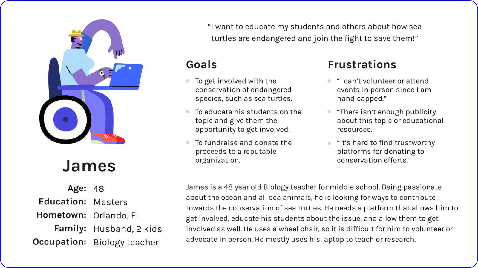
People who need a trustworthy, intuitive platform for getting involved with and contributing towards sea turtle conservation.
User research - Pain points
Busy, overwhelming user interface
<span data-metadata=""><span data-buffer="">Lack of trustworthy donation platforms
<span data-metadata=""><span data-buffer="">Unsure how to get involved and contribute
<span data-metadata=""><span data-buffer="">Lack of educational resources on conservation
User persona & journey map
User persona #1
User persona #2
Define
With the persona and user journey map in mind, the problem statement was created:
Busy adults who love the ocean need a trustworthy resource for learning about conservation, getting involved, and contributing to the cause because they want to help save and conserve endangered sea turtle species.
Ideate
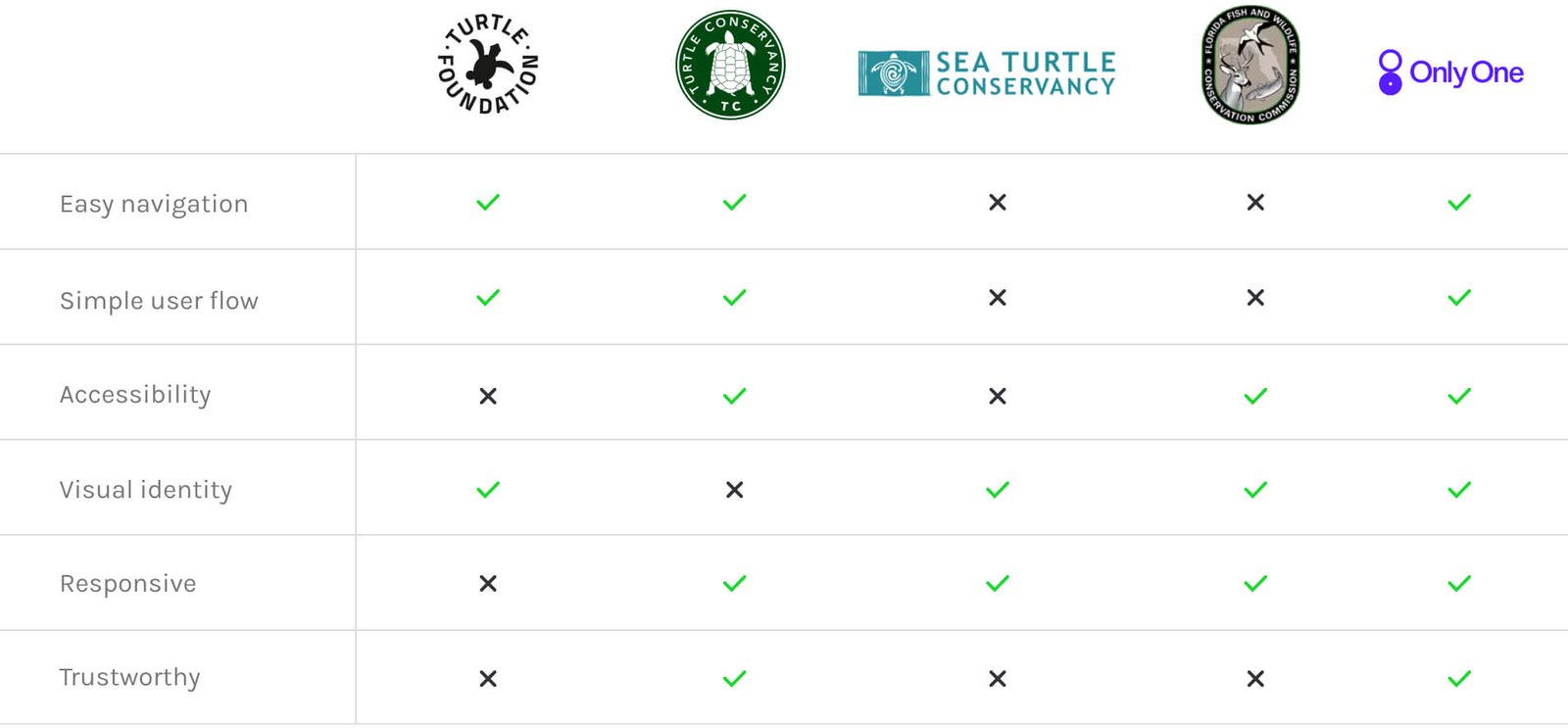
Competitive analysis
To further my user research, I collected info on what other sea turtle/ocean conservancy and donation platforms were doing and what user goals they were and weren’t reaching. By researching several competitors, such as The Turtle Foundation, The Turtle Conservancy, Sea Turtle Conservancy, Florida Conservation Commission and Only One, I was able to reveal the following insights.
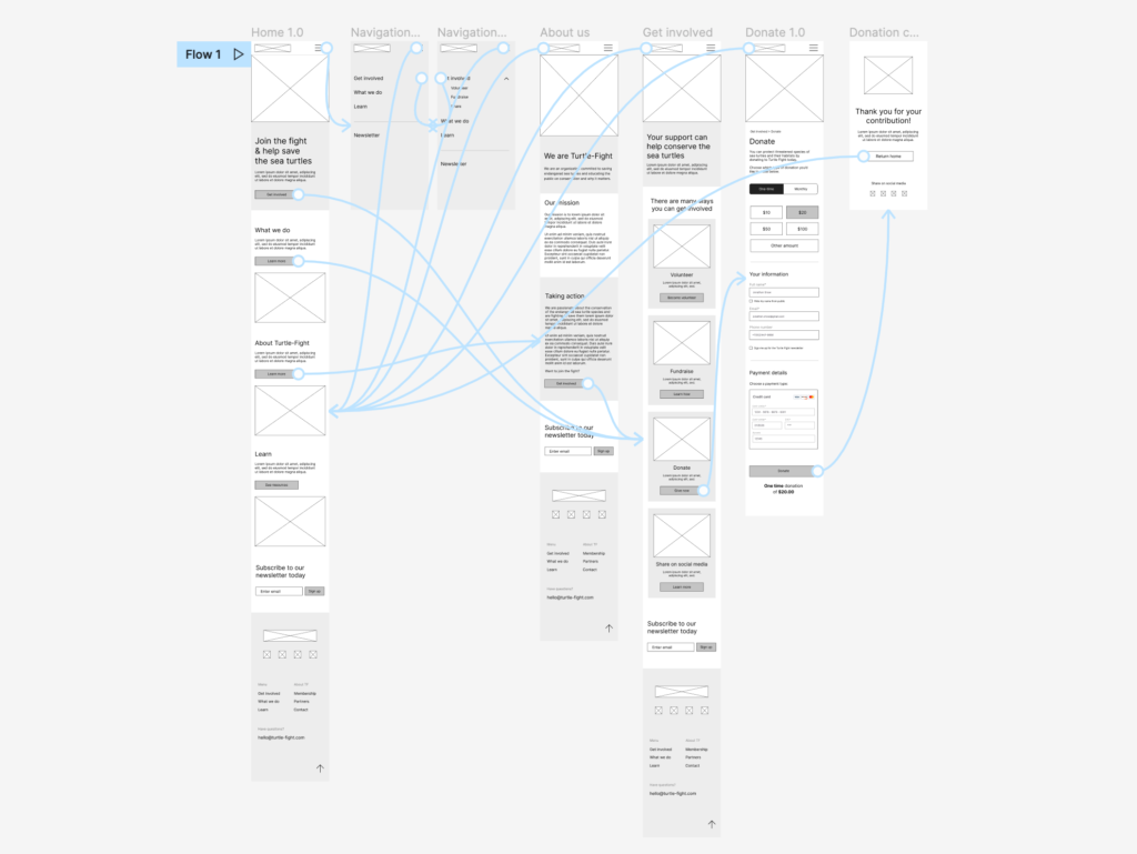
Information architecture - Sitemap
Based on all findings and research up until now, I created a sitemap, or clear, organized flow that takes the users from one task to the next. Organizing your site using a clear structure allows all site visitors, including those using assistive technologies, to navigate your site more efficiently.
Prototype
Paper wireframes
I created paper wireframes of the primary user flow which established the basic structure of the web pages and highlighted the intended function of each element.
Low fidelity prototype
From the paper wireframes, I created digital mobile wireframes. From here I created a low fidelity mobile prototype that provides a basic idea of what the primary user flow would look like and how it would function. The goal of this lo-fi prototype was to make designs testable through a usability study, so I’d be able to collect and analyze feedback early on.
Test
Usability studies
I conducted two rounds of usability studies. For the first usability study, I tested the low fidelity prototype on five participants. The findings from this first study helped guide the designs from simple wireframes to more detailed mobile mockups.
Usability study 01 findings
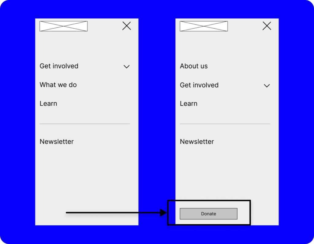
Insight One
Based on the theme that: for most users, it’s not immediately clear where they can find the donate button, an insight is:
Add the donate button to the navigation menu.
Insight Two
Based on the theme that: there isn’t enough trust built with the user and it isn’t clear that clear that the organization is reputable, an insight is:
Provide trusted charity trademark badges and show partner organization logos.
Insight Three
Based on the theme that: users want more options to pay since they don’t trust paying online with a credit card, an insight is:
Add more trusted payment options on the payment screen at checkout, such as Paypal.
Final Prototype
High fidelity prototype
The final high-fidelity prototype addresses user needs and accessibility standards, especially for date and time selections, payment options and a seamless navigation.